Introduction
This is a UI Kit for building out API/developer documentation in Webflow - with a similar UI to GitBook! Below you will find various sections which you can use for building out whatever type of documentation you need. To get started, here's an intro grid block which you can use to link to different sections/pages.
Lorem ipsum dolor sit amet, consectetur adipiscing elit. Suspendisse varius.
Lorem ipsum dolor sit amet, consectetur adipiscing elit. Suspendisse varius.
Lorem ipsum dolor sit amet, consectetur adipiscing elit. Suspendisse varius.
Lorem ipsum dolor sit amet, consectetur adipiscing elit. Suspendisse varius.
Code block
This is a block which you can put code in, that people can copy with one click! The code to make this work is in the sitewide body and head.
Callouts
Use these callouts to share important information - you can use grey to show neutral important information, yellow to share warnings, red to share limitations, and green to emphasise positive information.
Lorem ipsum dolor sit amet, consectetur adipiscing elit. Suspendisse varius enim in eros elementum tristique. Duis cursus, mi quis viverra ornare, eros dolor interdum nulla, ut commodo diam libero vitae erat. Aenean faucibus nibh et justo cursus id rutrum lorem imperdiet. Nunc ut sem vitae risus tristique posuere.
Lorem ipsum dolor sit amet, consectetur adipiscing elit. Suspendisse varius enim in eros elementum tristique. Duis cursus, mi quis viverra ornare, eros dolor interdum nulla, ut commodo diam libero vitae erat. Aenean faucibus nibh et justo cursus id rutrum lorem imperdiet. Nunc ut sem vitae risus tristique posuere.
Lorem ipsum dolor sit amet, consectetur adipiscing elit. Suspendisse varius enim in eros elementum tristique. Duis cursus, mi quis viverra ornare, eros dolor interdum nulla, ut commodo diam libero vitae erat. Aenean faucibus nibh et justo cursus id rutrum lorem imperdiet. Nunc ut sem vitae risus tristique posuere.
Lorem ipsum dolor sit amet, consectetur adipiscing elit. Suspendisse varius enim in eros elementum tristique. Duis cursus, mi quis viverra ornare, eros dolor interdum nulla, ut commodo diam libero vitae erat. Aenean faucibus nibh et justo cursus id rutrum lorem imperdiet. Nunc ut sem vitae risus tristique posuere.
Accordions
Accordions are an excellent way to share information which only some people will need to read - that way, you aren't distracting people who don't need it. This is controlled by a Webflow interaction
Lorem ipsum dolor sit amet, consectetur adipiscing elit. Suspendisse varius enim in eros elementum tristique. Duis cursus, mi quis viverra ornare, eros dolor interdum nulla, ut commodo diam libero vitae erat. Aenean faucibus nibh et justo cursus id rutrum lorem imperdiet. Nunc ut sem vitae risus tristique posuere.
Text formatting
You may need to indicate that a piece of text is to be used in code or an attribute. You can just add a styled span to indicate code.
Video block
I've not got much to say here - videos are great, and you should use them as much as possible to educate users on your product!
Image
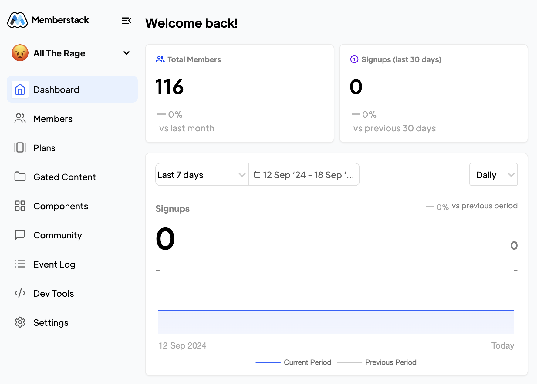
A picture is worth a thousand words! Use images as much as possible to show your users what you're trying to explain!